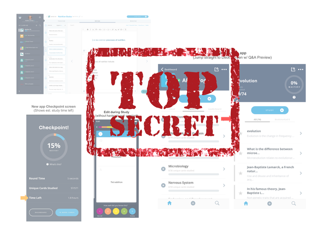
In the course of maturing into a larger company, many startups eventually run up against the dreaded "innovator's dilemma":
Innovator's Dilemma (n): The state where the cost required to rebuild the product from scratch becomes so insurmountable that it is tempting to instead just make incremental improvements to the legacy product, while accruing "technical debt" that makes it harder and harder for engineers to add additional features going forward.
This innovator's dilemma eventually dooms many companies to be "disrupted" by more nimble upstarts who aren't yet encumbered by millions of lines of "legacy code" landmines to wade through when making any changes to the product.
I recognized this potential threat to Brainscape's own product in around 2018. We'd become buried in so many user feature requests that it had begun to feel impossible to ever address them all -- at least if we were to continue to build on top of our increasingly clunky web & mobile app software architectures that were built nearly a decade earlier.
So we finally made the brave decision to step waaaay back and rethink the entire product -- everything from the study experience, to the flashcard authoring experience, to the mobile app itself -- and we engaged some of the world's top user experience designers, learning scientists, and software engineers to rebuild the product from the ground up.
In the process, we painfully recognized that this might mean spending a very long period of time "in the bunker" without much innovation perceived by the outside world. "What is Brainscape even doing?", some long-term power users have even asked us (sometimes not so nicely). "I've been asking for these features for 3 years, and Brainscape seems to have stopped improving the app." Believe me, I understand the frustration!
But we persisted with this full platform overhaul, and here in late 2021, Brainscape is proud to be finally unleashing our rebuilt architecture onto the world. You may have already received these updates as we carefully "roll them out" to all users over the coming weeks.
While this overhaul doesn't yet address all of our power users' long-requested features, it does address some big ones, and it lays the foundation for many future features and improvements that we will be able to make much more quickly and efficiently going forward.
What's new right now? (Oct. 2021)
Below are some of the big changes you can expect to see in the new Brainscape mobile app and web experience right away:
- More convenient mobile app navigation
- Easier flashcard discovery
- Faster mobile app performance
- Easier flashcard creation and curation
- A more efficient mobile study experience
- Ability to edit a card while studying
Please continue reading this article for more details, and for a teaser of what additional features may follow in the coming months and years!
1. More convenient mobile app navigation
Our legacy iOS and Android apps often tended to require "too many taps" to get from one feature to another. For example, Search My Cards and Find [public] Flashcards were buried in the three-line "hamburger" menu in the top-left. And even just trying to see what friggin' flashcards were in a deck required three taps.
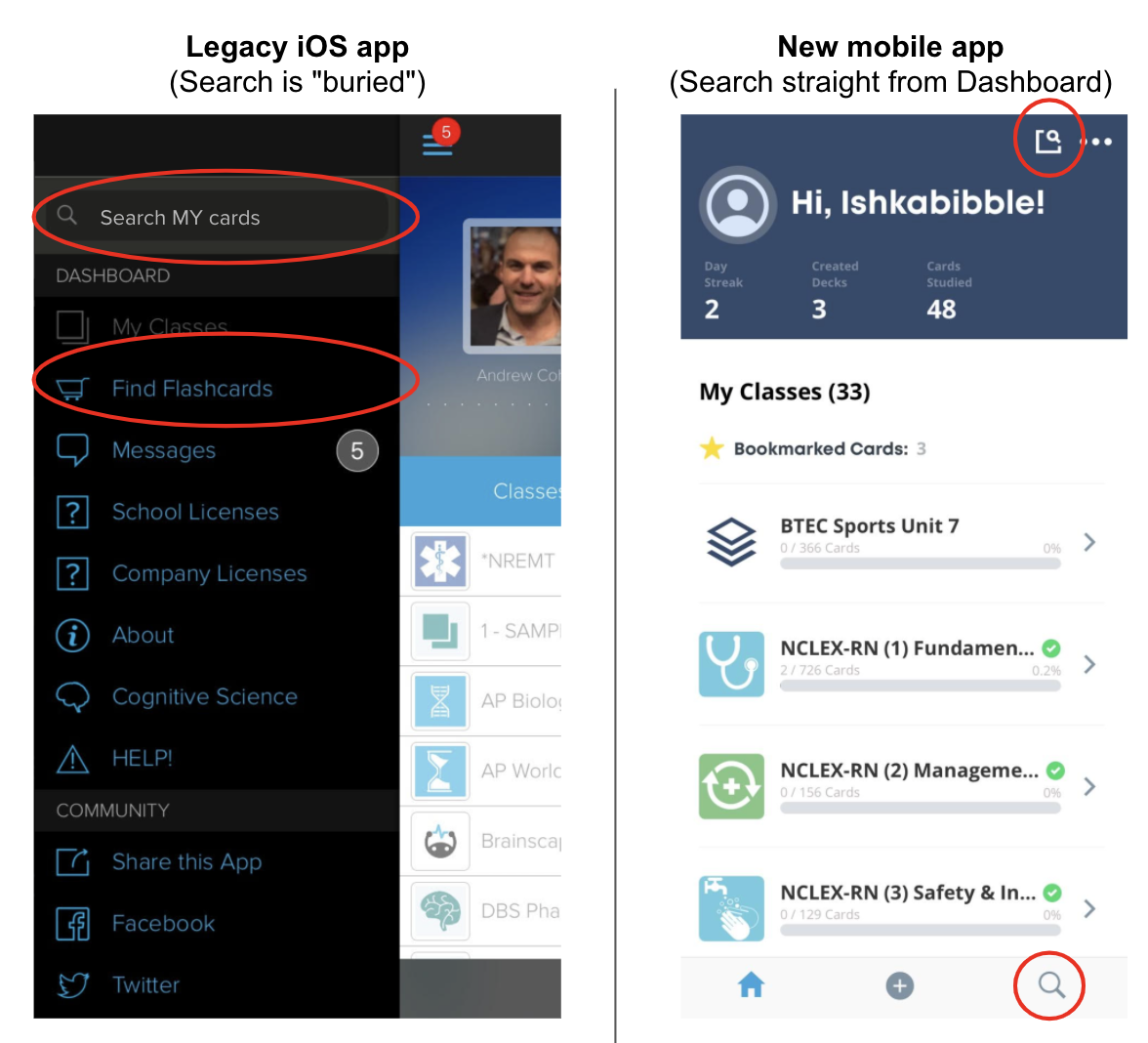
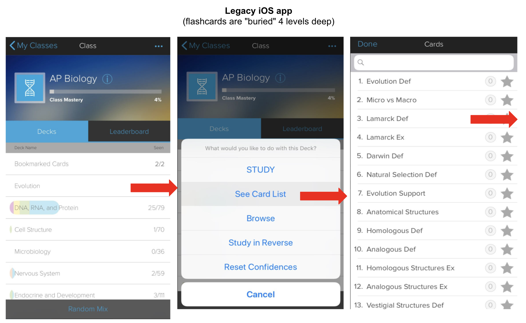
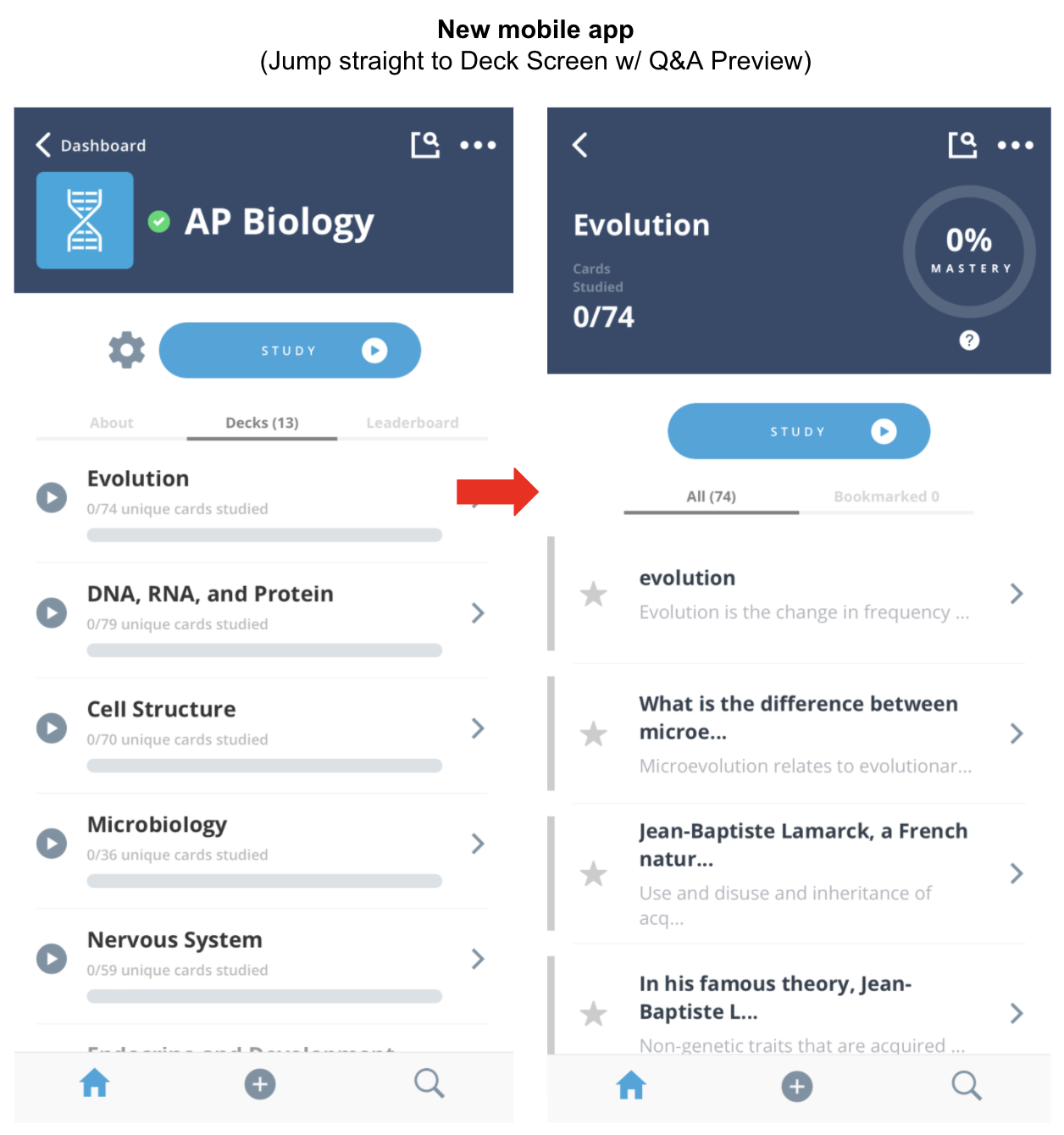
The removal of these frictions will ultimately save thousands of hours of wasted taps across all Brainscape users -- not to mention providing a new framework within which it will be easier to incorporate future features in future versions of the app.
Additional info for the tech geeks: The architecture for our original iOS app was written back in 2010, in the language Objective-C. Brainscape's new mobile app navigation and UI have been rebuilt in React Native.
This rewrite in React Native will allow us to share a single code base between our iOS and Android apps (rather than maintaining two separate mobile app codebases). Further, the mobile app's React Native code is also now able to share much of its code logic with our web app, which has similarly been rebuilt with its cousin "React" as the front end.
Brainscape's big bets on React [Native] will allow us to release much more seamless app updates across platforms going forward.
2. Easier flashcard discovery
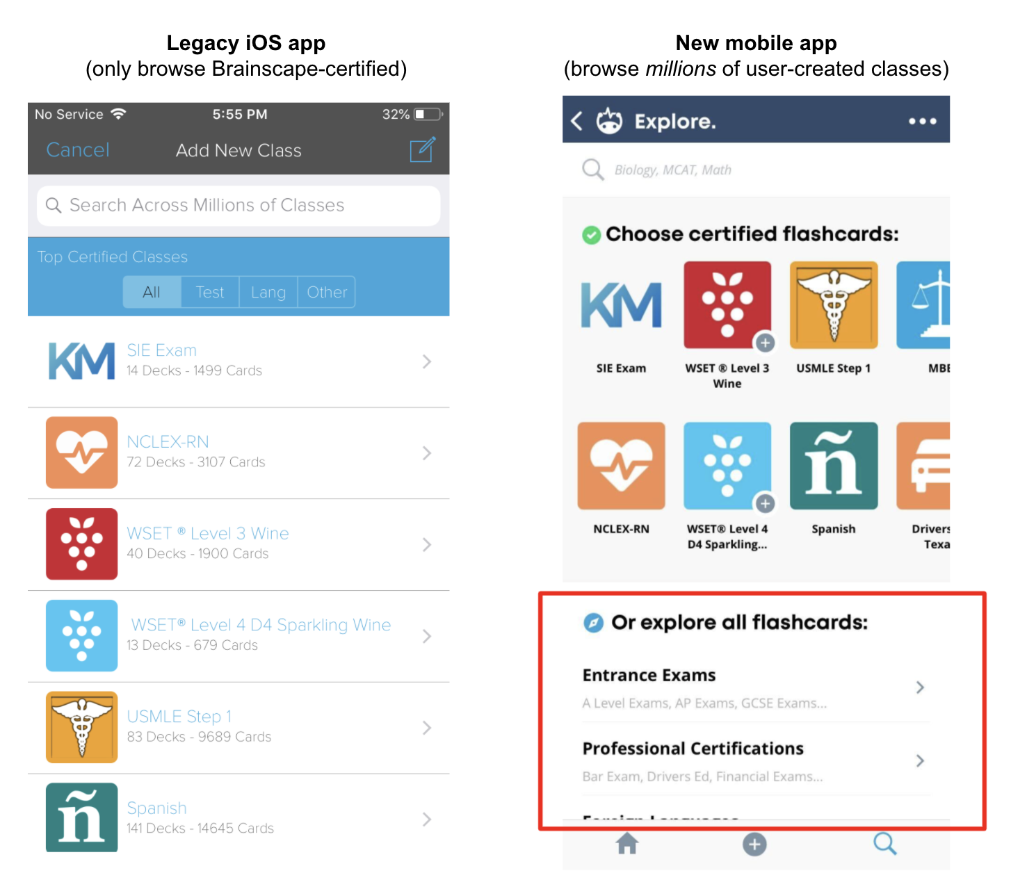
In our legacy iOS app, whenever you went to search the Brainscape Knowledge Genome, we only showed you a list of the few dozen "Brainscape-Certified Classes" that we have created with our expert content partners (so far).
If you wanted to search for any other subject, you would have had to manually type in your query into the search bar. There was no way to "browse" the thousands of other subject areas for which our users create flashcards (but for which Brainscape has not yet "certified" with a content partner).
In the new mobile app, tapping the Explore tab brings you to a more comprehensive navigation where you can browse all subjects (including both Brainscape certified and user-created flashcards) to your heart's content.
As you may have already concluded, the more subjects you are studying with Brainscape, the greater your gains in study efficiency compared to studying each subject in another method.
3. Faster app performance
Our legacy iOS app historically required syncing your entire account with the Brainscape server every time you updated your data, and it blocked you from continuing to use the app while your decks downloaded.
The new mobile app will sync only the incremental changes between the app and the server, and it will download content in the background so that you can continue using the app (and start studying already-downloaded decks) even while the background sync proceeds.
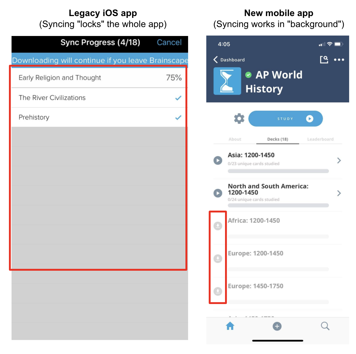
These changes -- along with many other optimizations under the hood -- should make the app faster, smoother, and less likely to experience crashes.
4. Easier flashcard creation & curation
In the process of analyzing our data and prioritizing technical work for this product overhaul, we realized that the vast majority of user-generated flashcards are created via Brainscape's website. Sure, plenty of people create and edit flashcards in the mobile app, but users who create, organize, and/or share hundreds of flashcards almost always use the web app (and then later sync those cards to their mobile app to study).
For this reason, we have placed a ton of thought and effort into the redesign of the web-based flashcard editor. Our main goal was to replace the legacy "simple editor" which has historically provided merely a list of spreadsheet-like plain-text fields with a tiny flashcard canvas and few controls to help organize large numbers of flashcards.
The new Brainscape flashcard editor finally brings all the benefits of our legacy "advanced editor" into one single new & improved flashcard authoring experience.
The new Brainscape flashcard editor
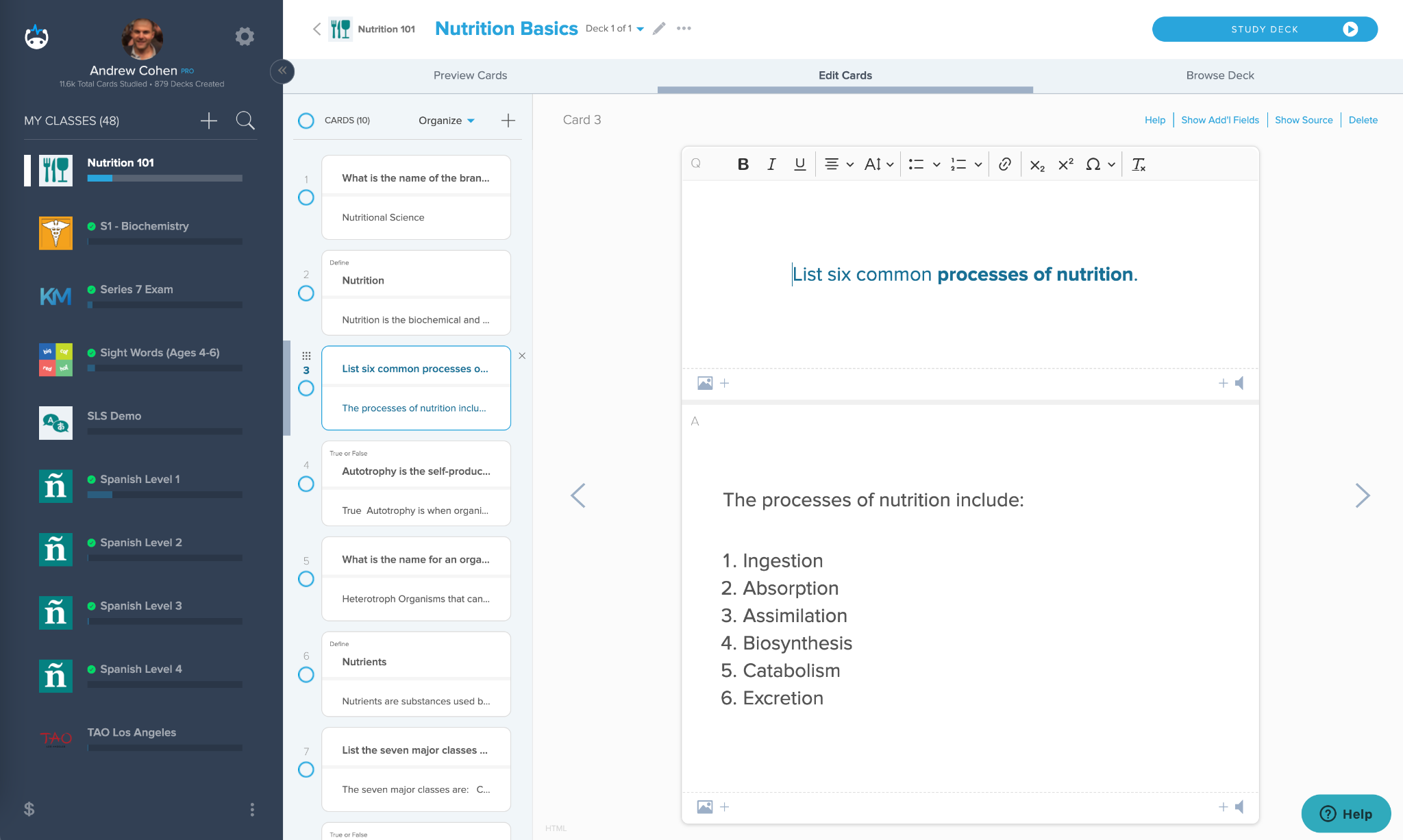
As you can see, the new sidebar shows you a snippet of both the question and answer, while the main area of the screen gives you a much larger "canvas" and an "Organize" menu that allows you to more easily move, cut, copy, paste, and reorder flashcards -- including even between decks (if you open both decks' editors in separate browser windows).
Brainscape's new editor is also an order of magnitude smoother to work with and to navigate between cards using keyboard shortcuts. You can read a full description of the changes to our editor in this article on our Help Center.
Even better, the editor's new technical foundations (built-in "React") will also make it much easier for us to (finally!) allow users to add and change images on flashcards right in the mobile app which you can already do on the Brainscape iOS app. We hope to be releasing that feature on Android in the coming months.
5. A more efficient study experience
Users who have studied on Brainscape's website over the past two years may have noticed that the web study experience had evolved further than the mobile study experience had. Well, y'all may be happy to know that our new mobile app has now "caught up" to the big improvements that web users have been enjoying all this time.
Here are five of the biggest improvements:
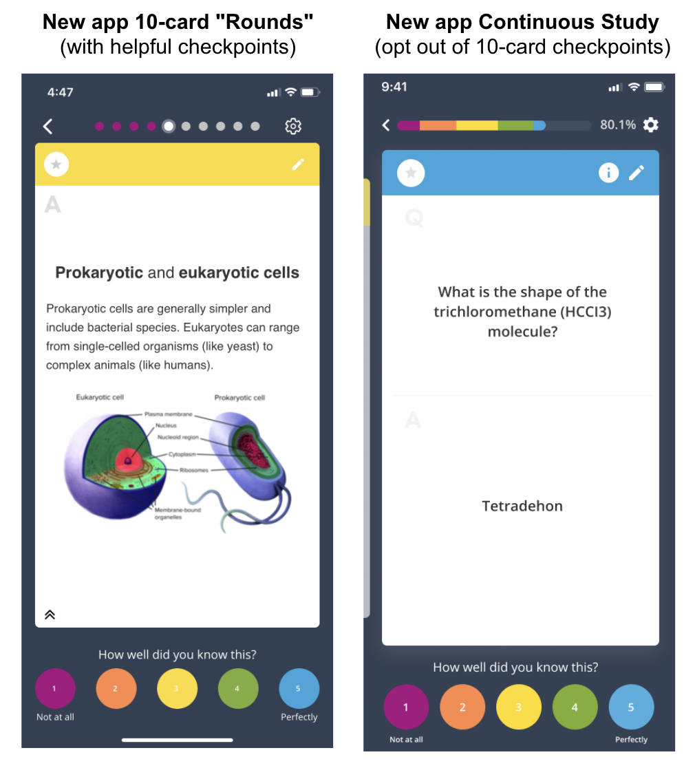
1. 10-card Study Rounds -- You no longer have to waste a step to choose how many cards to study in each session. Since our data showed that nearly all users were just sticking with the recommended 15 cards at a time or downgrading it to 10, we have simply broken down all study sessions into quick & achievable 10-card rounds that give you quick Checkpoints along the way.
Our web study experience has shown this to be vastly more motivating and engaging since you'll have constantly achievable milestones rather than feeling like you need to master an entire deck at once. Studying in short chunks (and then taking short brain breaks) is also much more effective at helping you retain new information.
(Note that you can always switch back to "Continuous Study" mode if you hate these encouraging Checkpoints.)
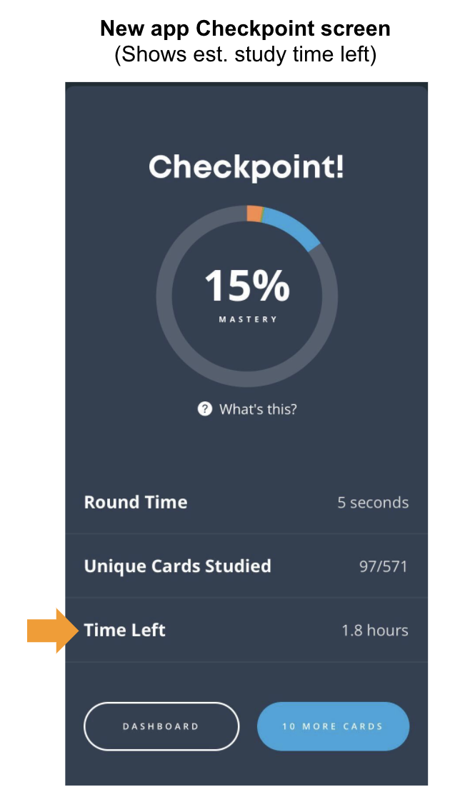
2. "Time left" Estimates -- Based on the pace at which you increased your Mastery during each recent 10-card study round, we are now able to estimate how much longer you would need to study in order to reach 100% Mastery of that selected deck or study mix.
Of course, the definition of 100% Mastery is up to you (is it just for a test tomorrow? Or do you really want to remember it for the long-term and be stingier with your "5's"?). And we still recommend that you allocate that remaining study time across as many days or weeks as possible.
The important thing here is that knowing an estimate of the remaining learning burden ahead of you can now be a tremendous help in planning your ongoing study activities.
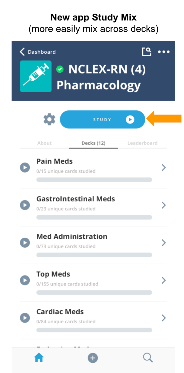
3. Custom "Study Mixes" -- No longer do you have to choose a specific deck to study or lump all your decks into one giant global study mix that you can't configure.
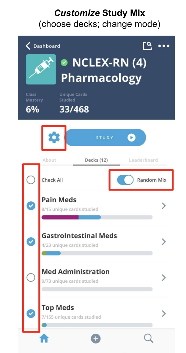
The Brainscape mobile app's new master "Study" button now allows you to select exactly which decks you would like to include in a study mix. This will help you focus on the decks that are most important for your current purposes, such as for an upcoming cumulative exam. (Creating study mixes across classes will come in a future release.)
4. Random vs Progressive Mode -- The new Study button also allows you to select whether you want cards to appear from any Random deck (of course weighted by your confidence ratings) or whether you want to keep the default Progressive mode (which progresses starting with the first deck) -- of course with the ongoing spaced repetition built-in for already-studied flashcards.
5. Faster Study Navigation -- The technology underlying Brainscape's new mobile study experience should feel smoother to proceed between cards, and to switch back & forth from Study mode (with spaced repetition) to Browse mode (to preview cards in order). Most "sluggishness" from the old app should now be eliminated!
6. Ability to edit a card while studying
This last one is a "little thing", but it's my favorite. You can now easily edit a flashcard directly from the Study screen, without having to navigate all the way back to the Dashboard and then find that specific deck in order to edit it.
Presuming that you have "edit" permissions for the deck in question, all you have to do now is tap the "pencil" icon on a particular flashcard, and you can edit the card in a little pop-up window without having to leave the Study screen!
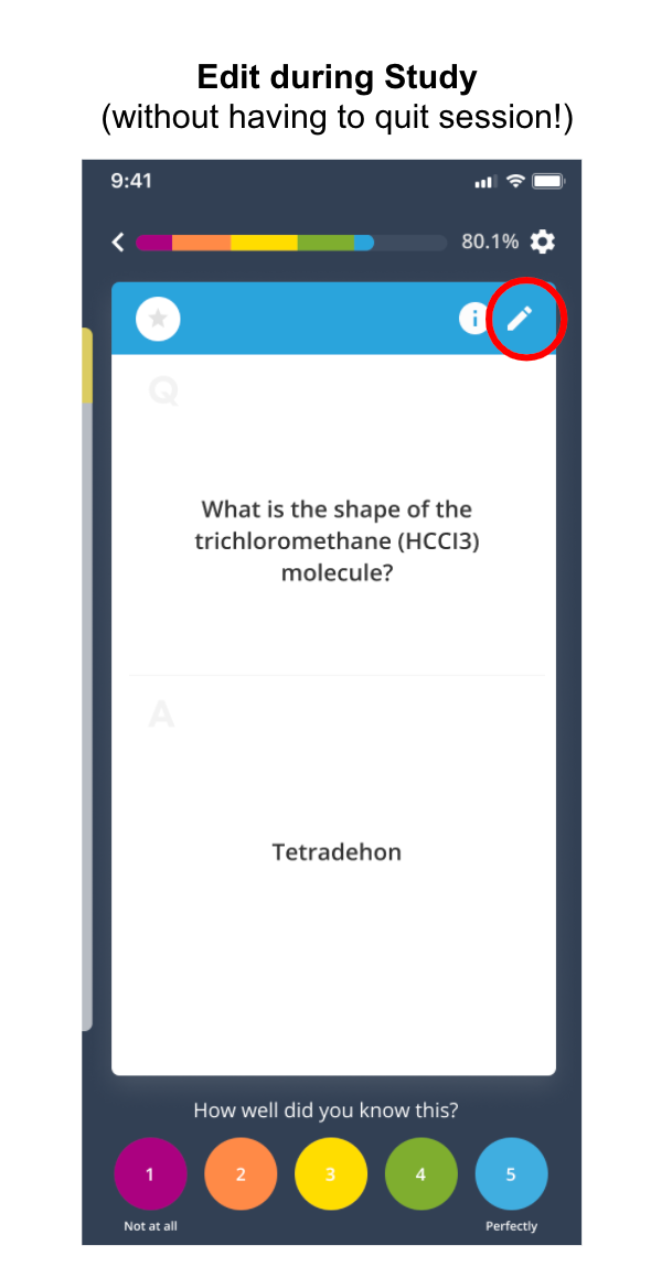
This feature should now empower you to more efficiently "iterate" on your flashcards while you study, to create exponentially better content over time.
Upcoming features we're working on
As I mentioned earlier, this new mobile and content authoring architecture is merely the foundation of a new set of improvements that Brainscape's software designers and engineers will be able to make going forward.
Here are a few additional improvements you might see in the near future:
- The ability to alter flashcards' format using "fields" within the card
- The ability to add images straight from the mobile app
- The ability to study a mix of flashcards across classes
- "Study reminder" notifications to help you maintain your daily streak
- The ability to study "starred" flashcards via the website
- Tons of other small quality-of-life improvements
- Even bigger changes in the years to come
Brainscape remains committed to making our study experience the most efficient and convenient in the world. If you have any additional feature requests or comments, please feel free to add them to our user community, and we will make sure our Product team knows about it!
And thank you as always for being a believer in the future of studying that we are building toward. My team and I look forward to continuing to help you rise to all your challenges.
Sincerely,
Andrew Cohen
CEO, Brainscape
